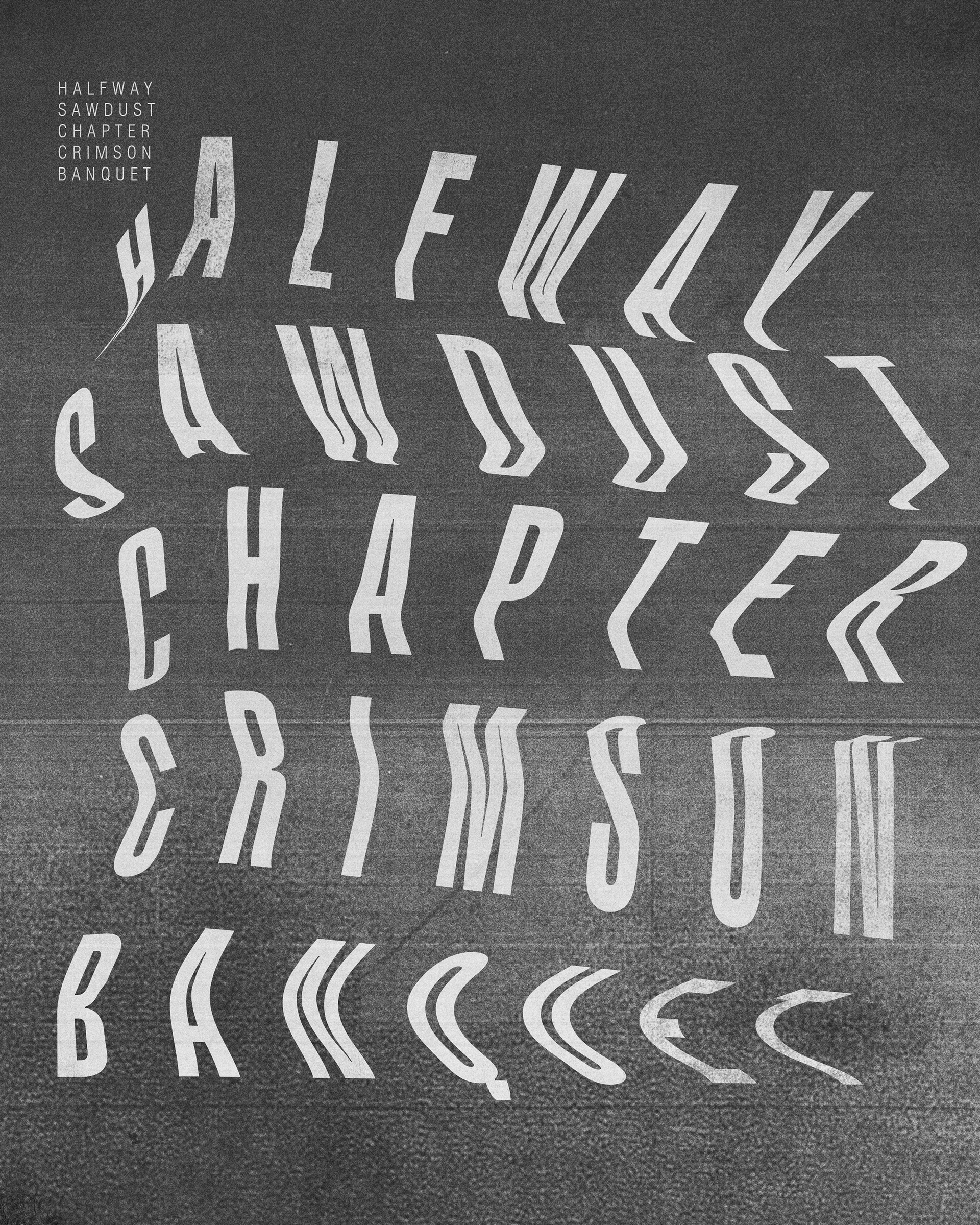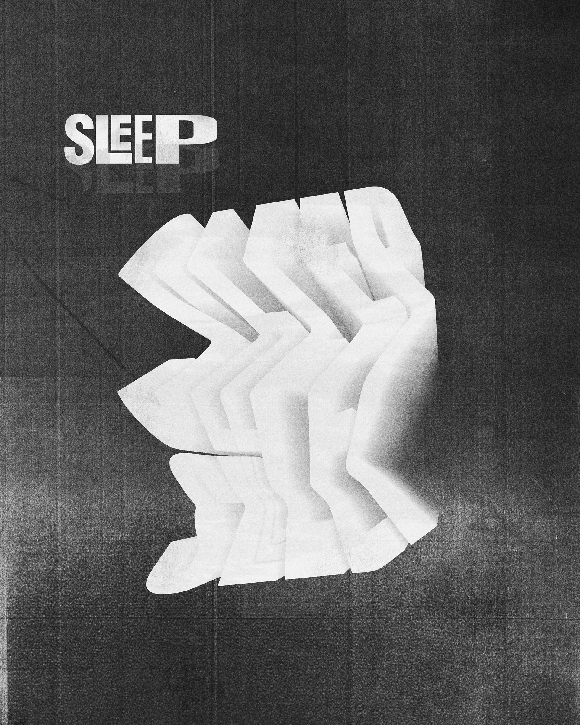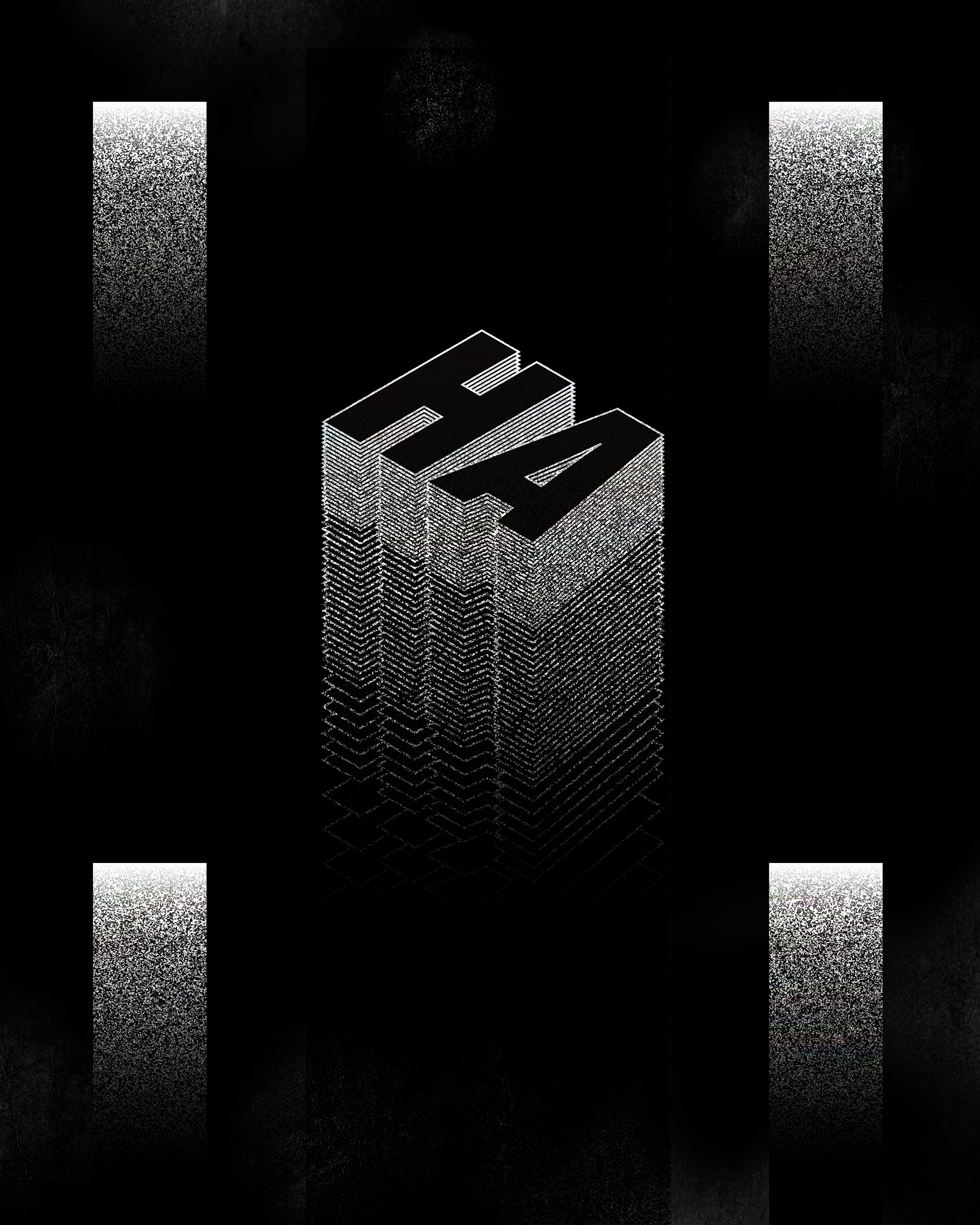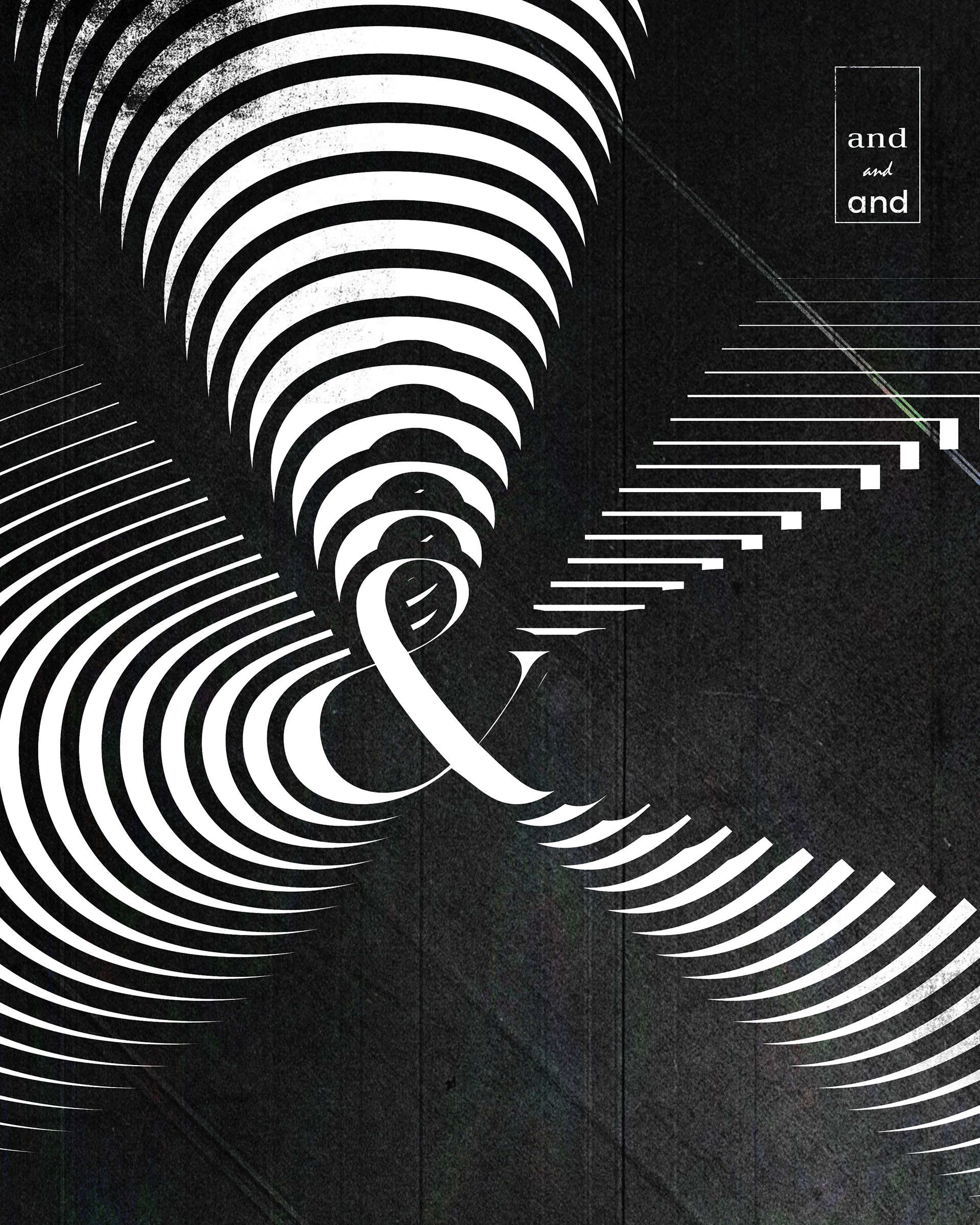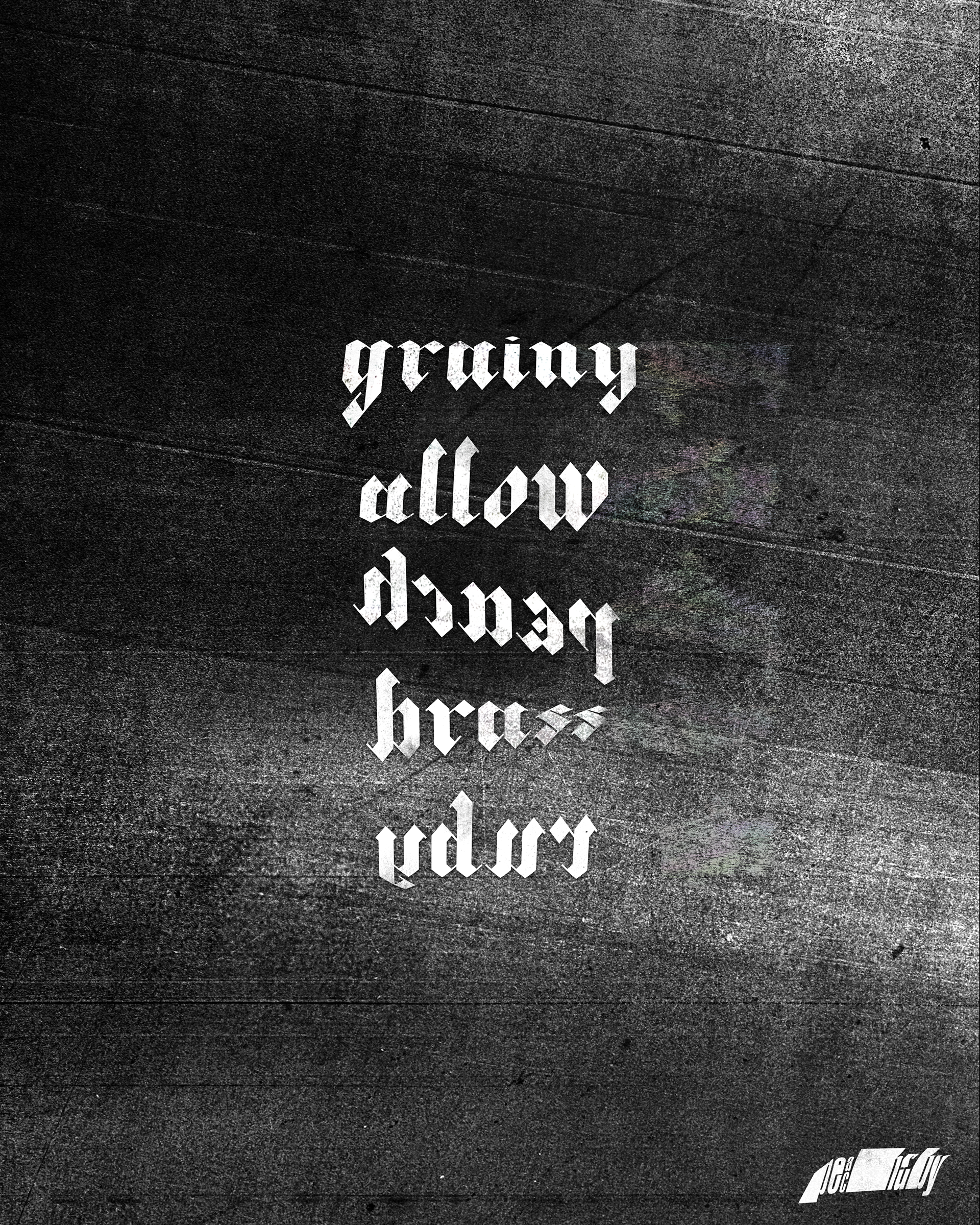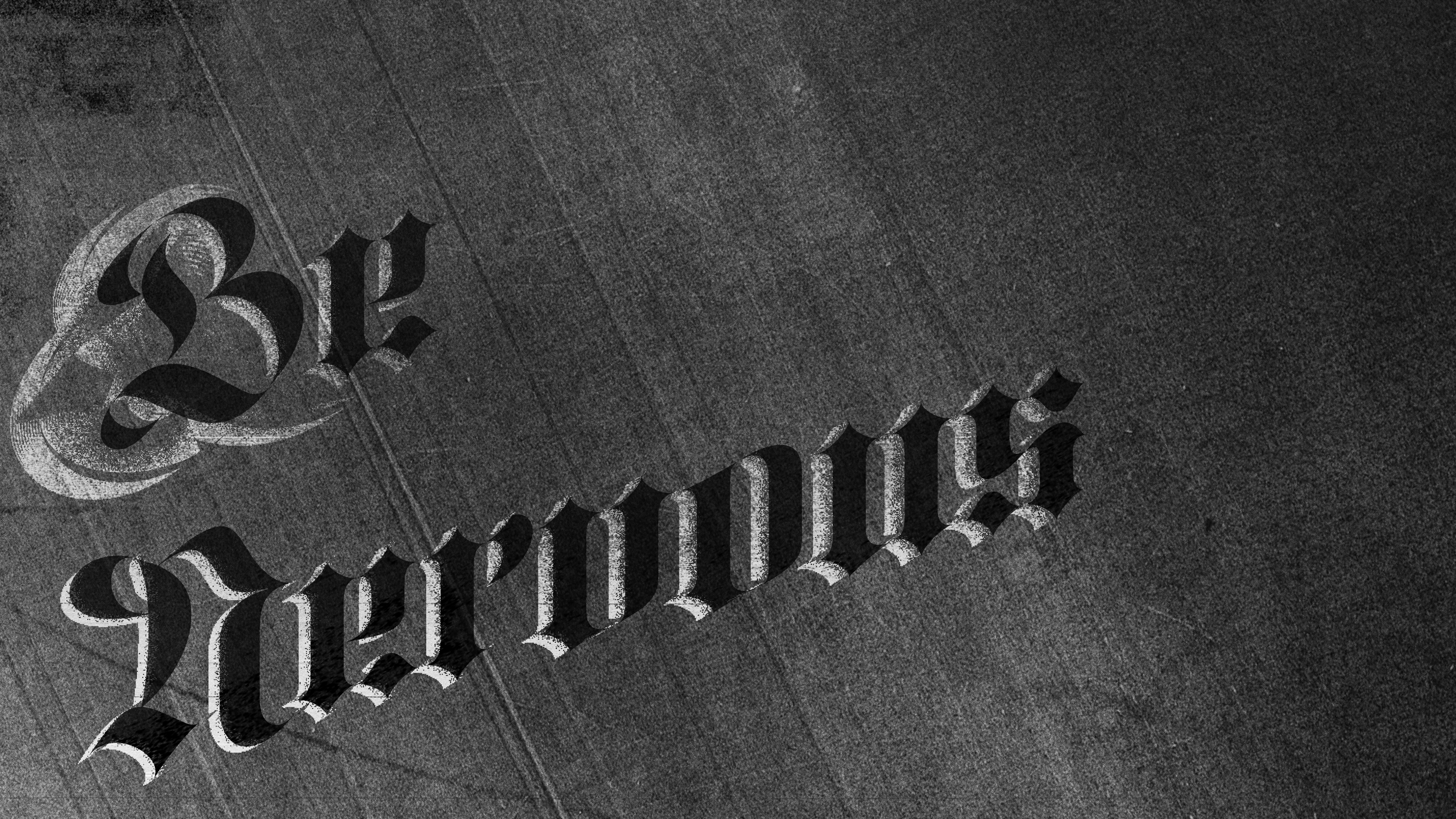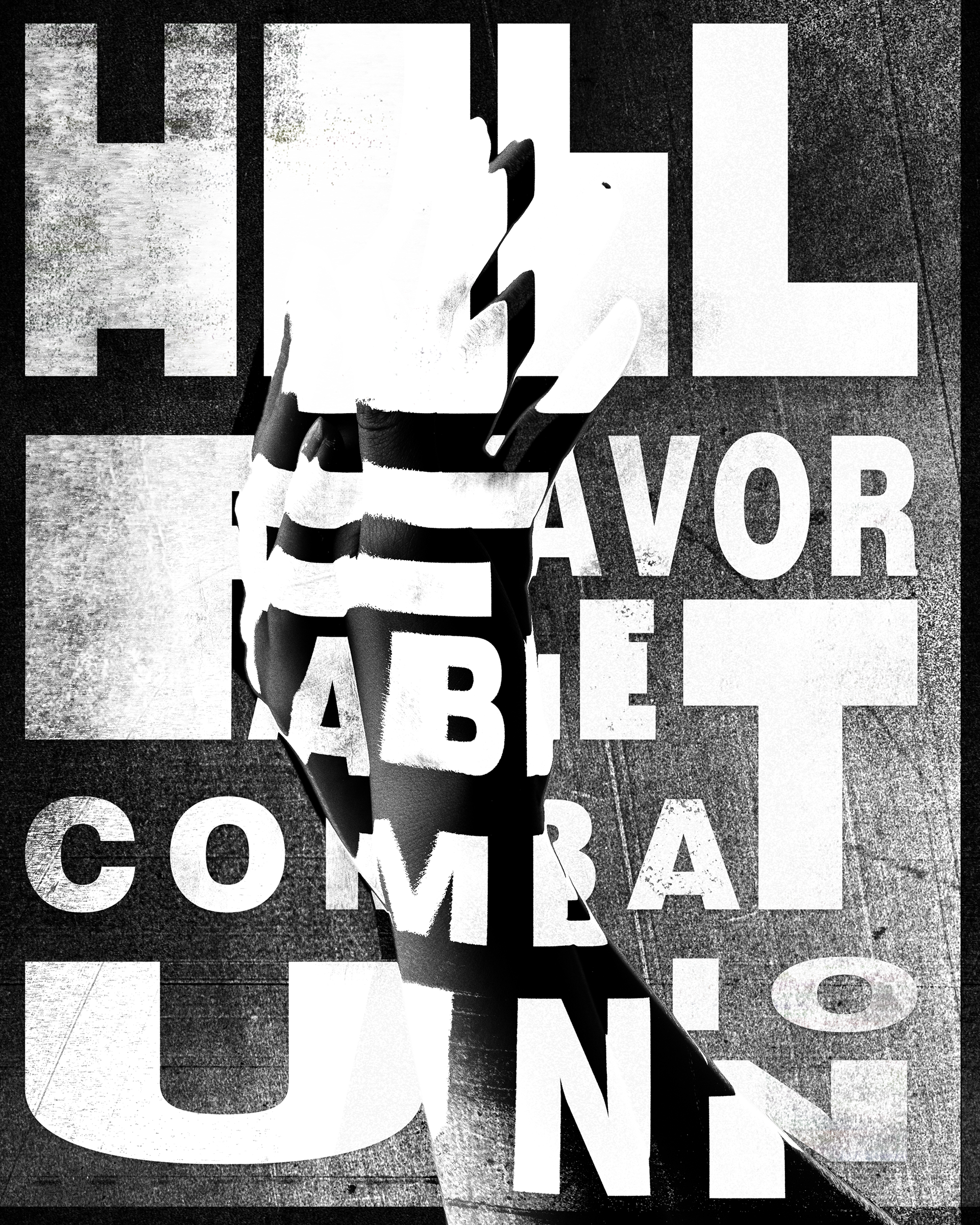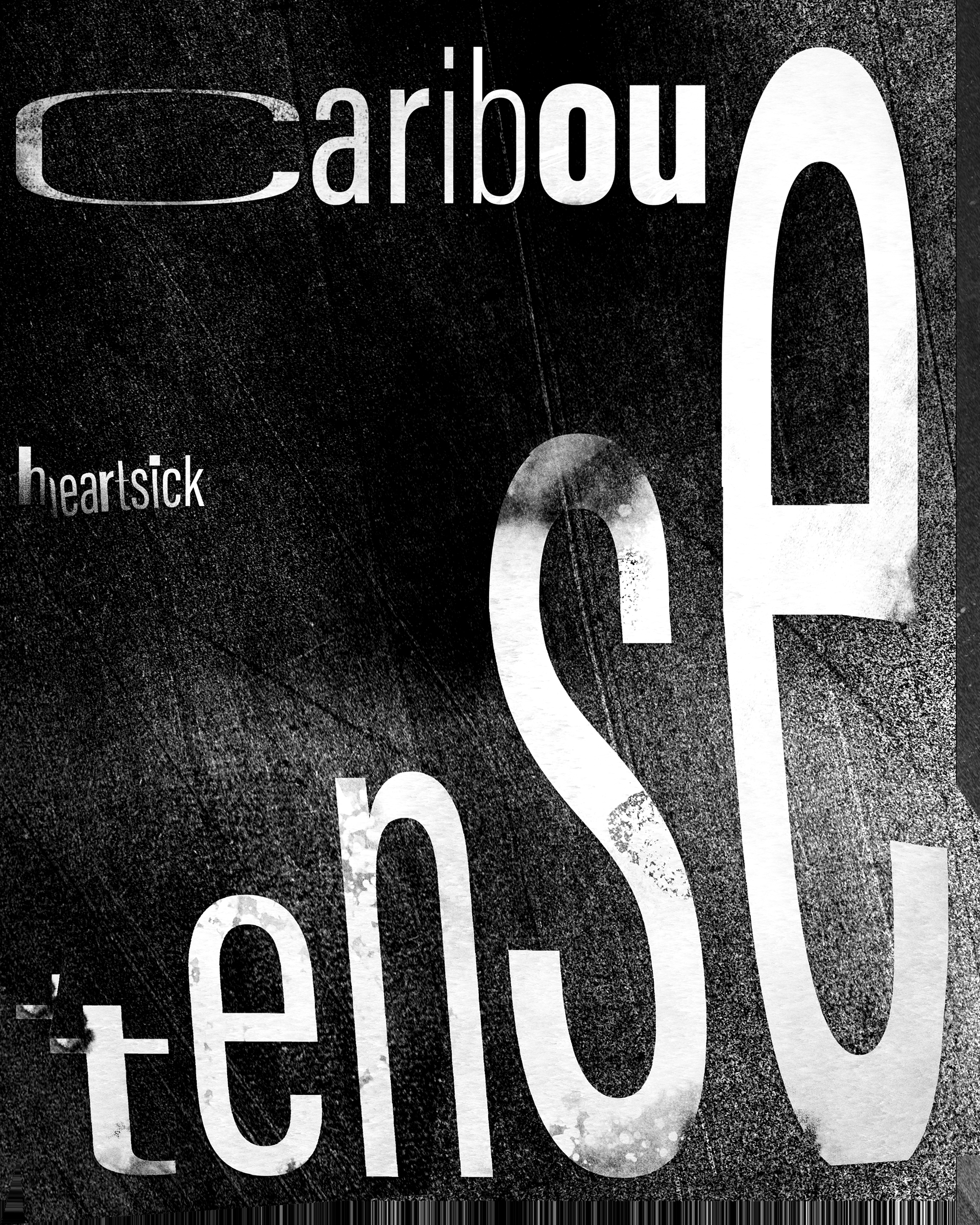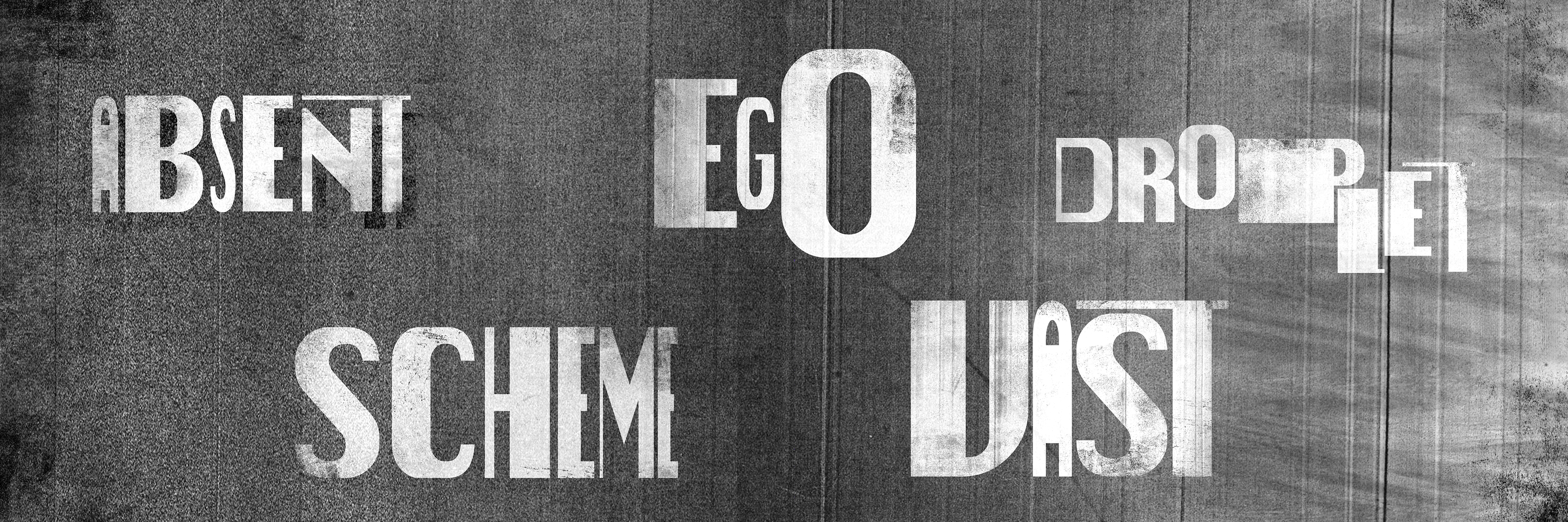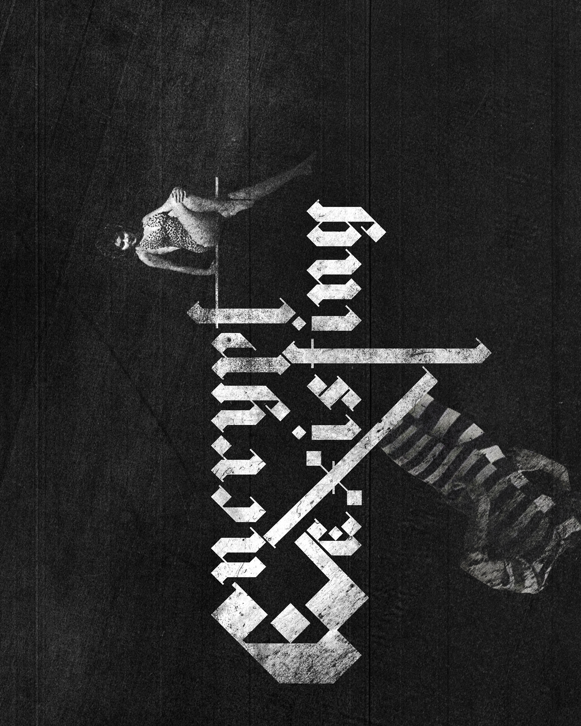
My goal with this project was to expand what I knew about typography, and how to make things that shouldn't work be able to stand on it's own. I wanted to push what I knew about editorial design and materials, and how to play subject matter off of the way the work is printed. I wanted to see if I could find meaning in meaningless random words through typography and editorial design.
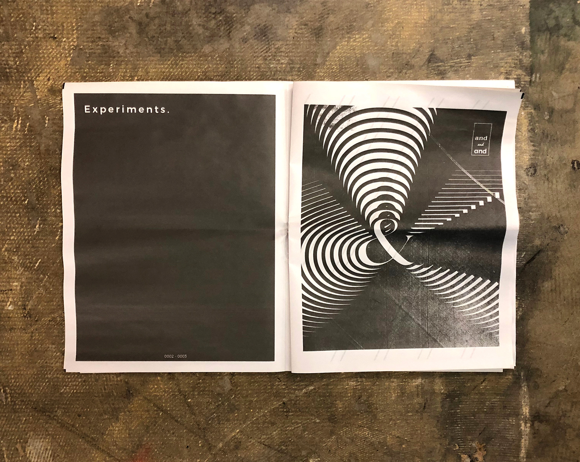
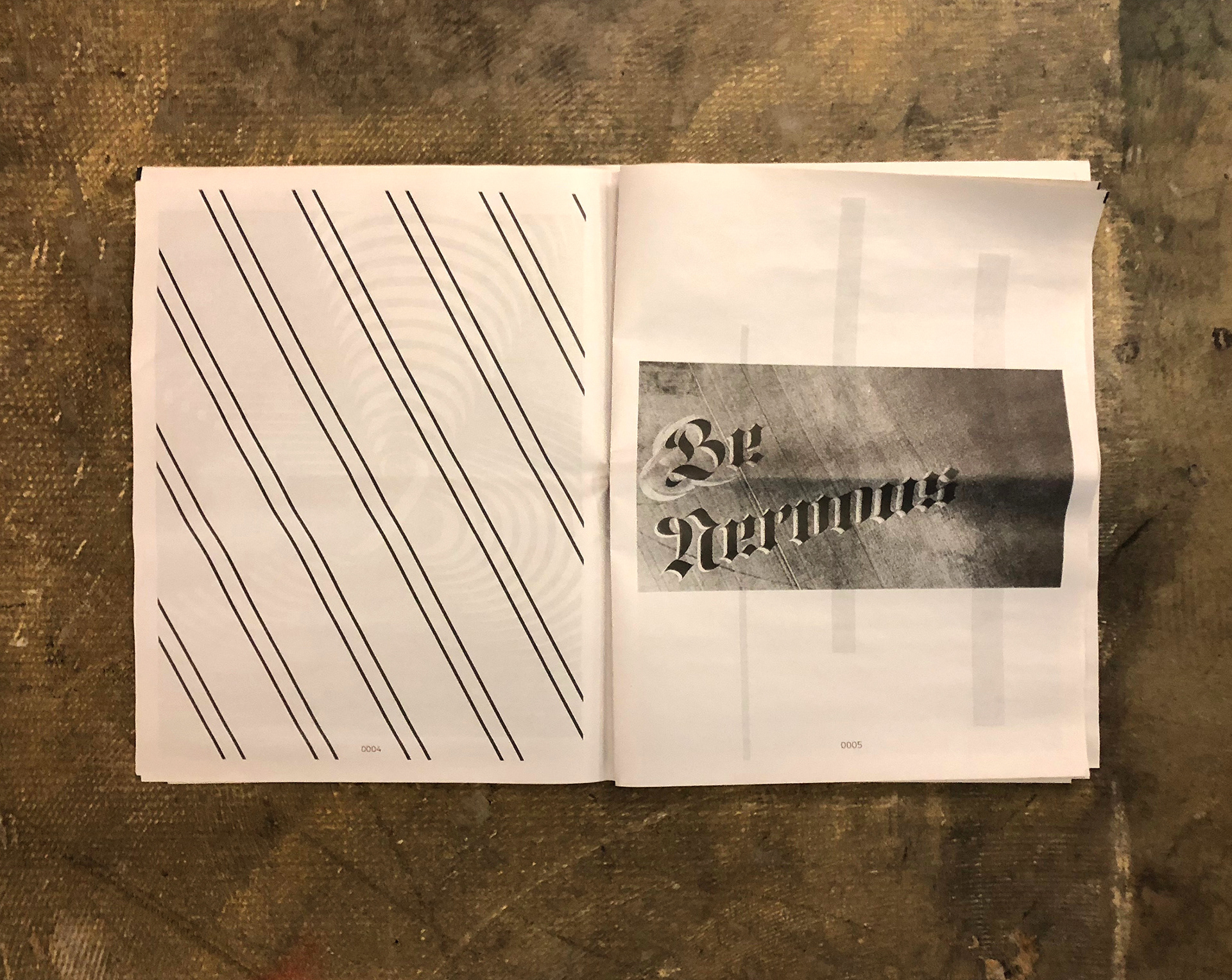
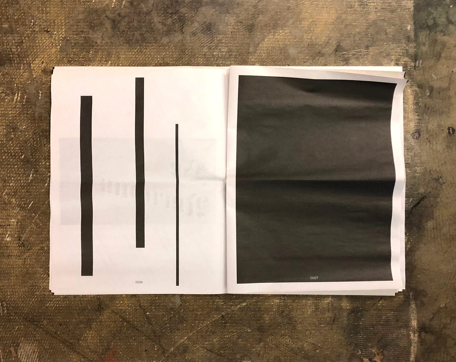
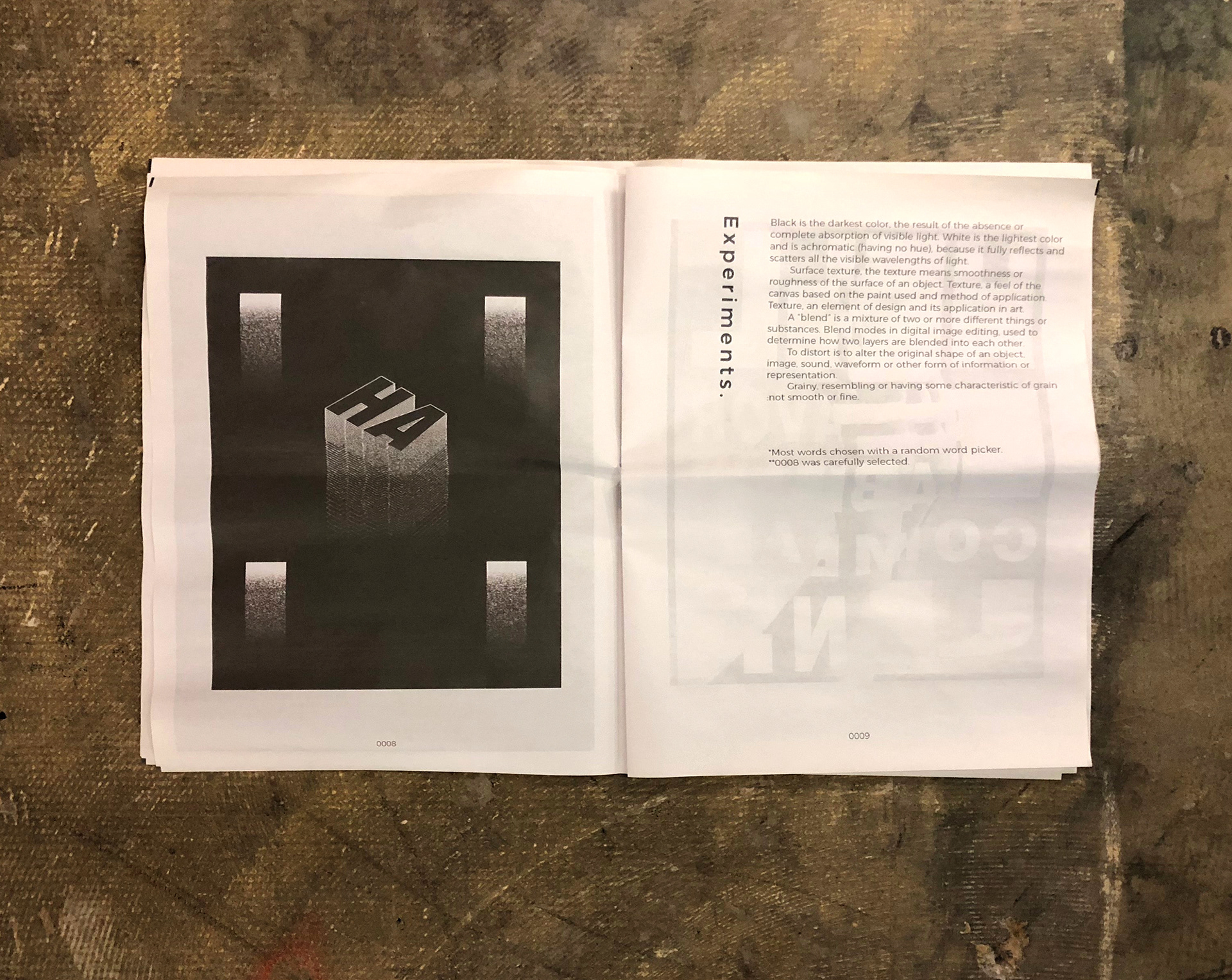
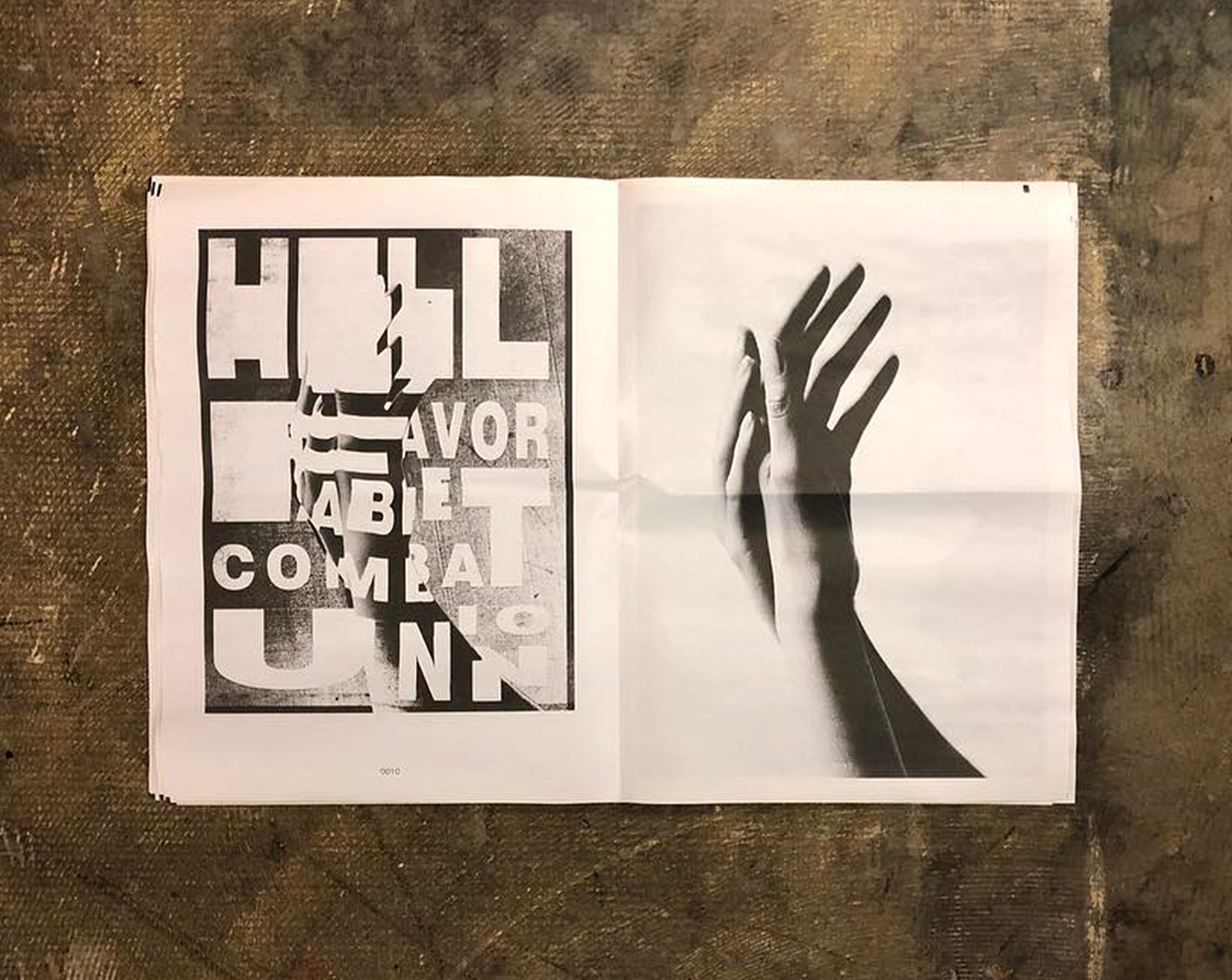
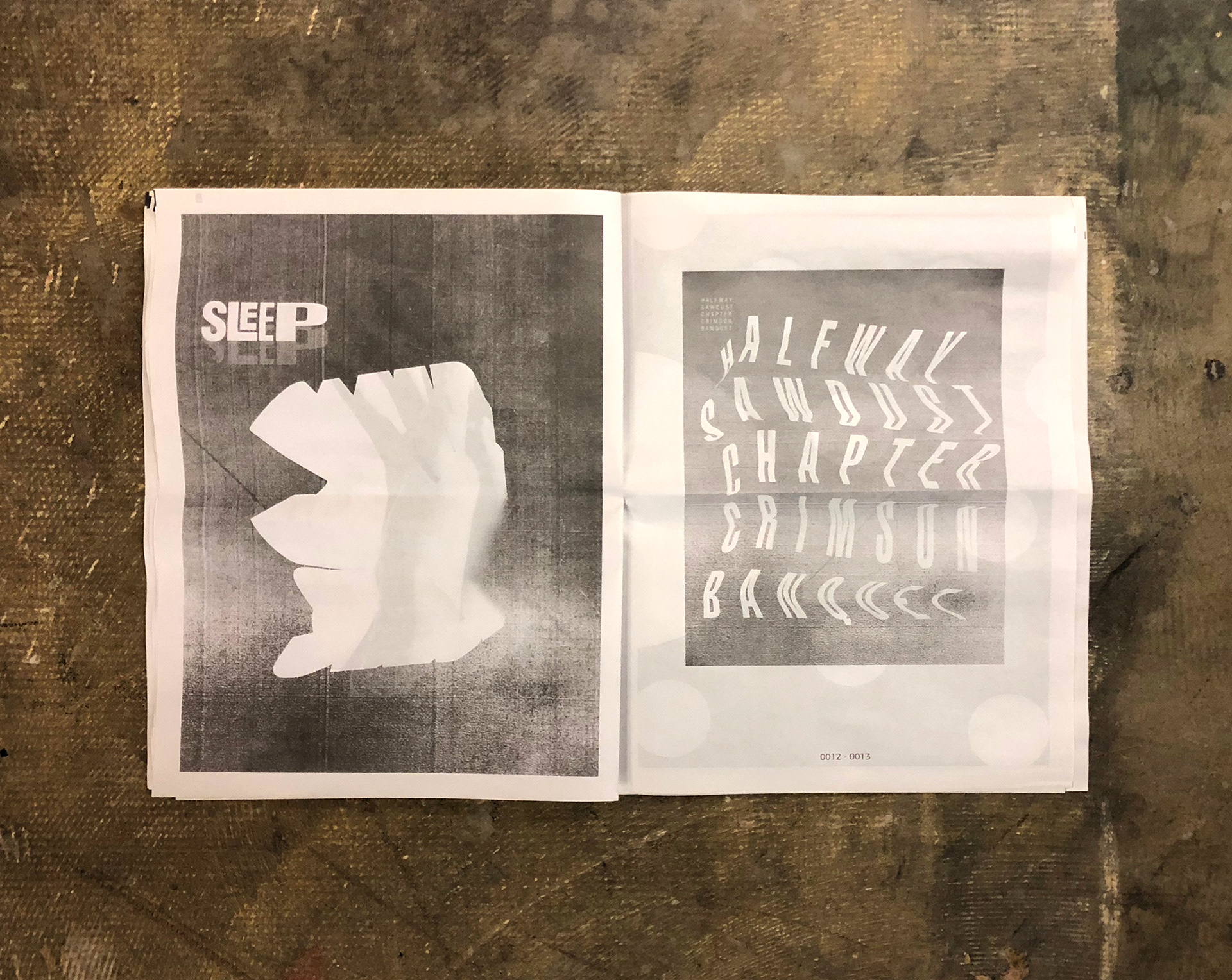
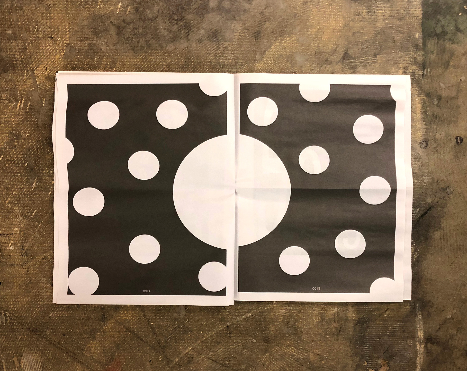
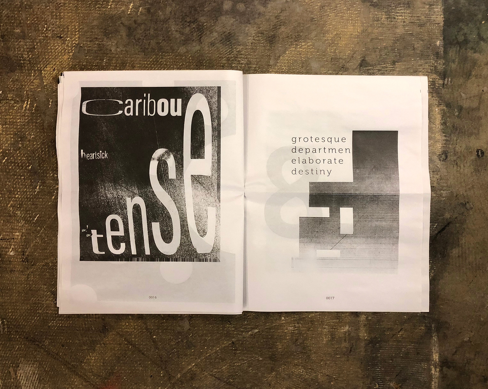
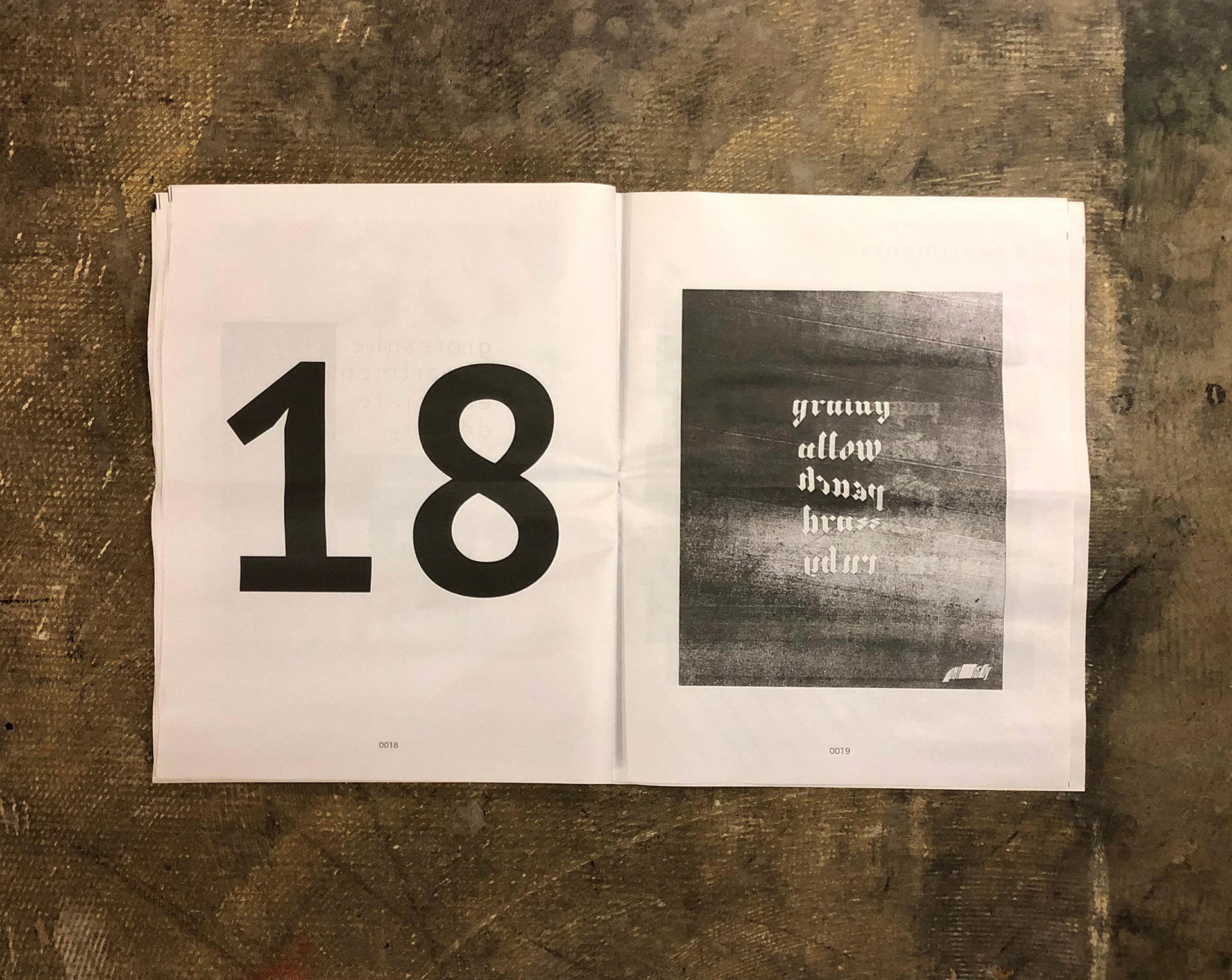
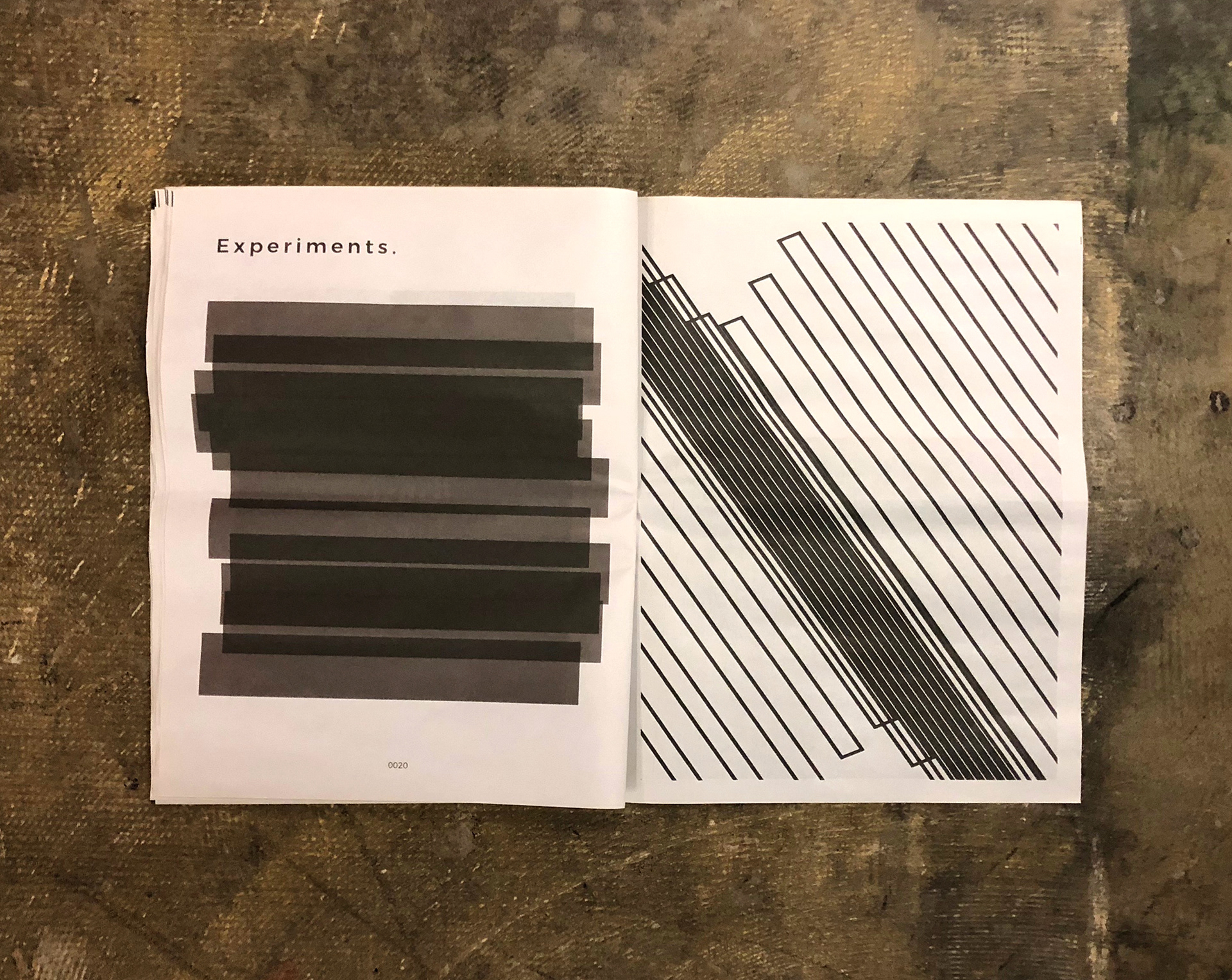
I set out to experiment with the boundaries of type, distortion, textures, envelopes distortions, and blending. I wanted to destroy typography, or shape it in unconventional ways to complicate what was already there. I would gather random words from a generator, and then blend/warp/distort/destroy these words in ways that would amplify their meaning or remove meaning altogether.
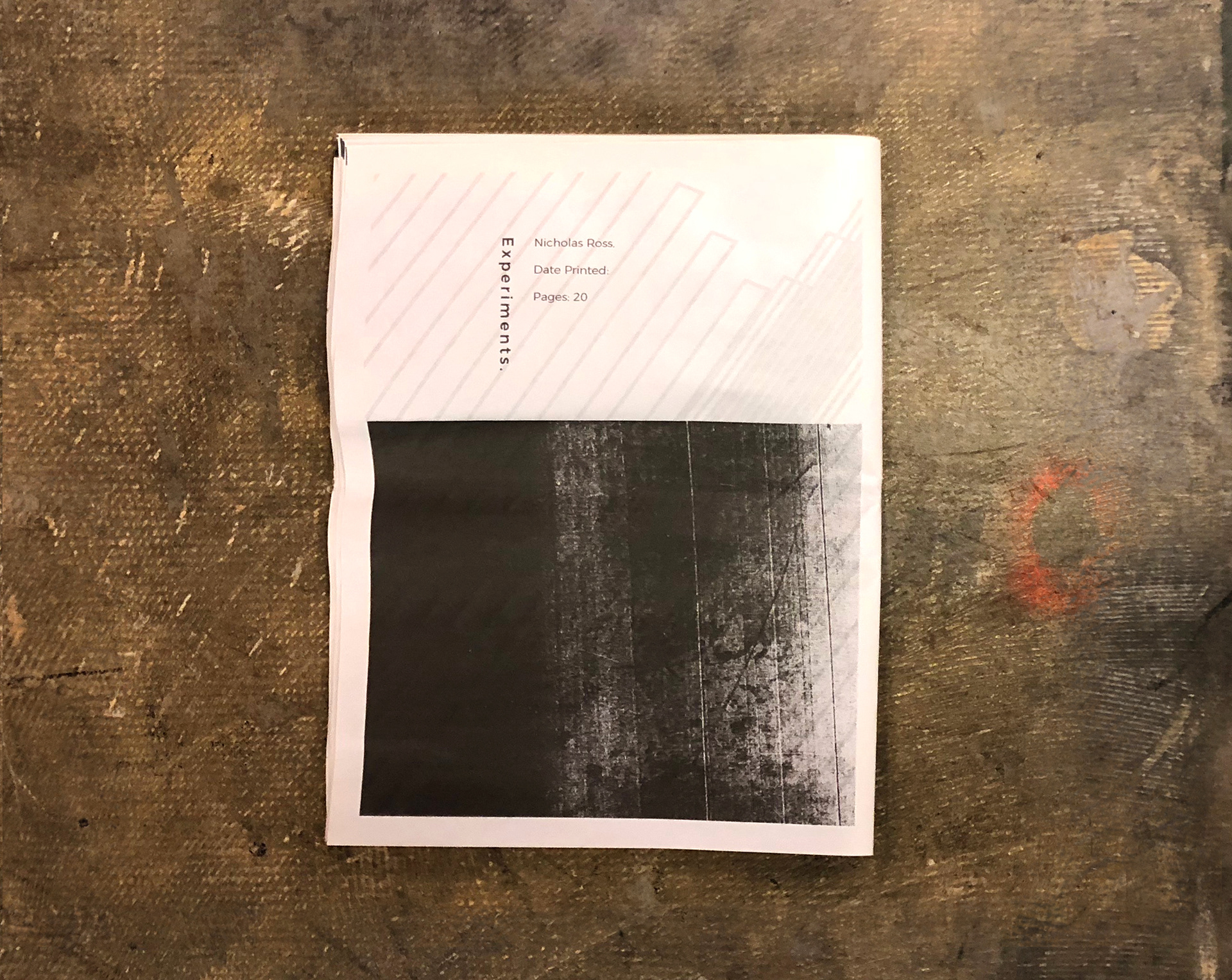
Once I had a collection of work, I focused on printing the works on newspaper. I thought that by going with this quality of paper and ink, it would aid me in my goal of creating a more fragile publication to contrast the bold experiments. I wanted to produce something that I could use as a non-traditional business card. Something that could be left out on a coffee table, shared, and admired.
Publication -
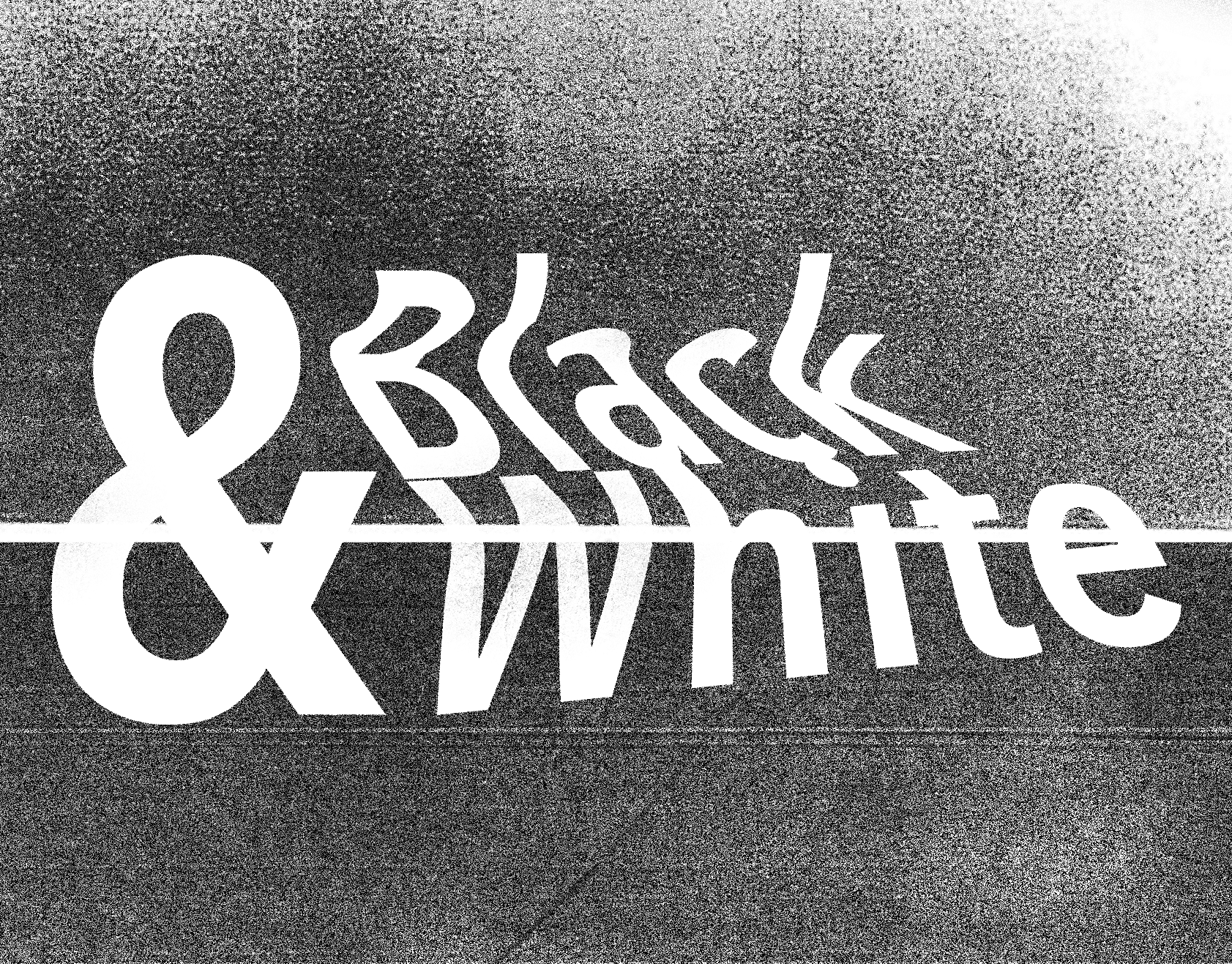
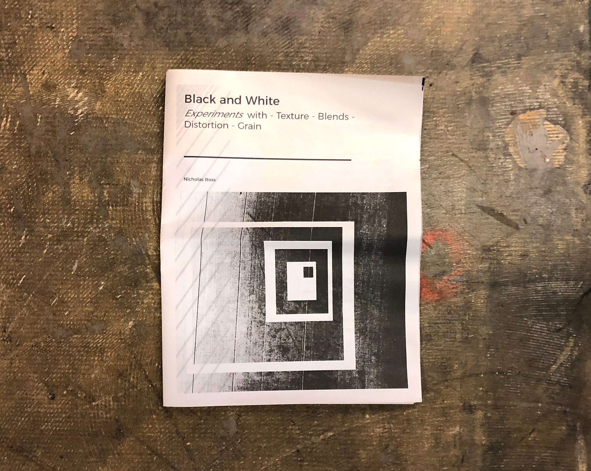
Black and White: Experiments with - Texture - Blends - Distortion - Grain
Global Trend Awards Quest Winner
--- Marketing/Promotional Materials --- Self Promotion
__________________________________
Pieces -